Project Statement:
A collection of graphics I’ve put together in my free time over a semester. I wanted to put a bit of a focus on Typography as I feel I have something to prove. I want to try to synthesize my worlds and projects with my graphic design work. The focus is to get myself into the habit of looking at my art through a graphic design lens.
Project Description:
I want, by the end of the semester, to have myself together. I chose my topic because I need to flex my muscles under the tutelage of a graphic designer rather than an artist and learn how to synthesize the two mediums. I plan to have different experiments with the idea of graphic design. interactions between images and the text connected to them. Multiples and how graphic design can be applied to character design. Using symbols to symbolize ideas. My daily spark is to work on posters and graphics that I could print out and paste on random garbage and are related to my 3000 projects that I love dearly, I have no favorite child (That’s a lie, It’s PAQETS, I have thought about it constantly and consistently for the last 5 years but my KILL THE projects are catching up in how fun and adaptable they are to work on)
Project Rationale:
I hope to gain footing in this world and a new major. I want to get my foot in the door. I’m a renaissance man, a jack of all trades, it keeps me on my feet and versatile in this crazy world. My dream is to be an independent artist and keep myself afloat with my own projects, but I expect that to take a while. Getting an industry job doesn’t seem horrible, but it doesn’t seem great. I need control of my own future. I need to keep the doors open.
Project Plan:
My plan is to make 40 of these pictures by the end of the semester. I will be using different techniques, typefaces and projects to cover multiple different visual identities. I will use multiple overlay effects and learn to use more art applications then I’m used to in my comfort zone with procreate. I will start with Procreate and move on to other applications later. I’m used to drawing in it. I want to think about including photographs. I want to reimagine my old art. There’s gold in those roughs from when I was 14. I will spend 20 minutes, 4 times a week, working on these posters.
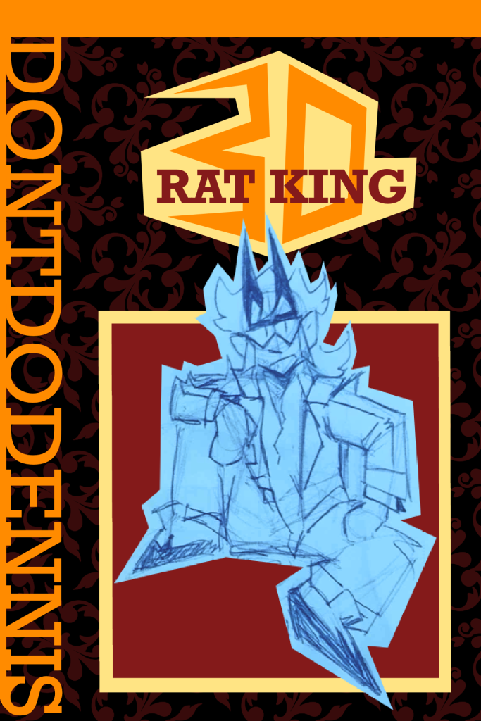
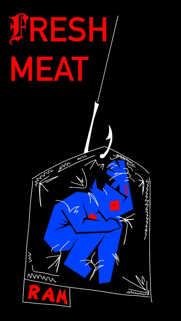
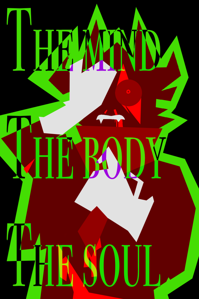
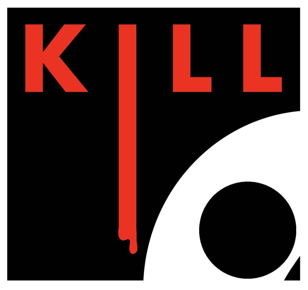
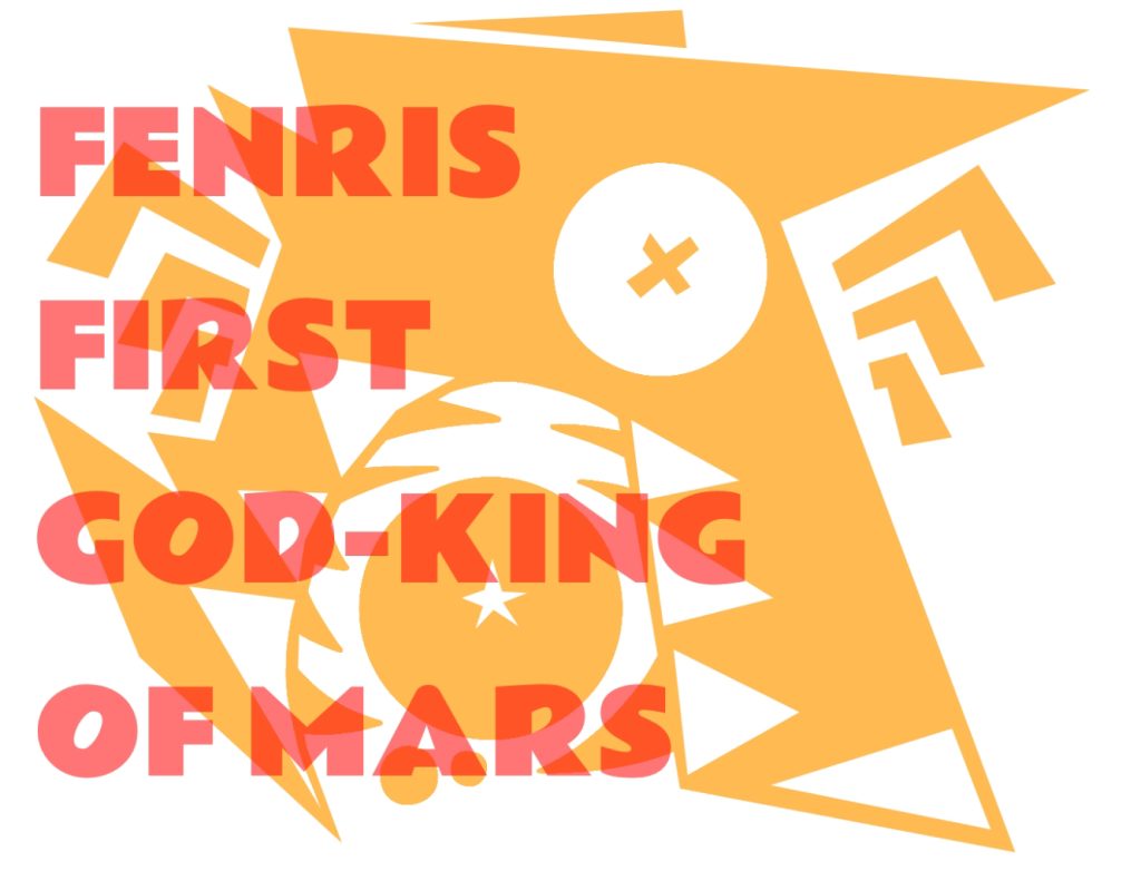
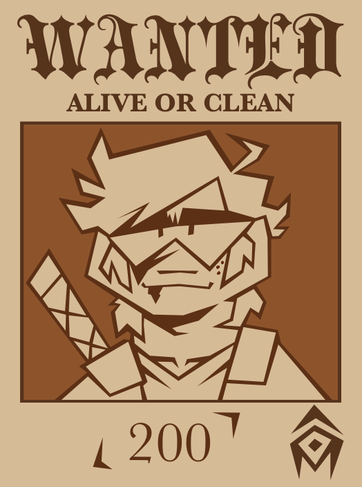
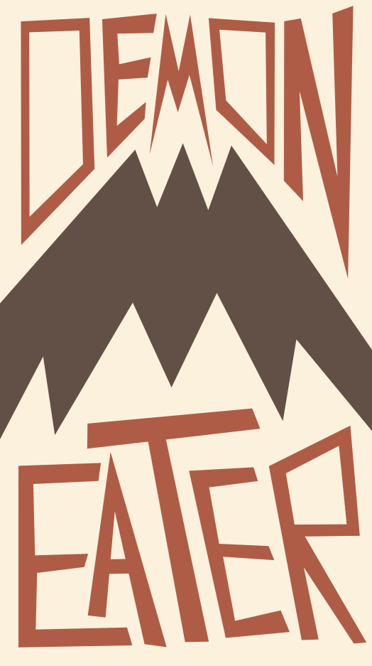
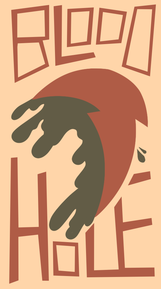
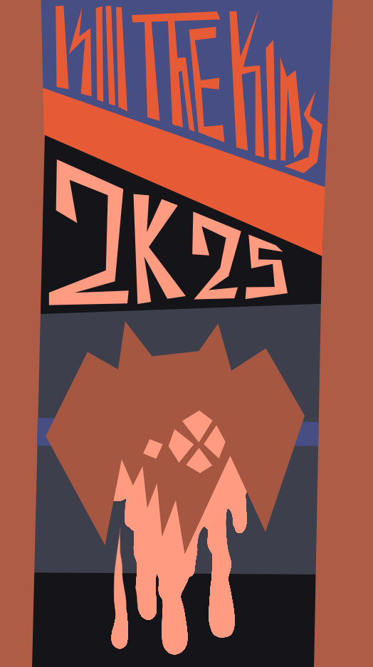
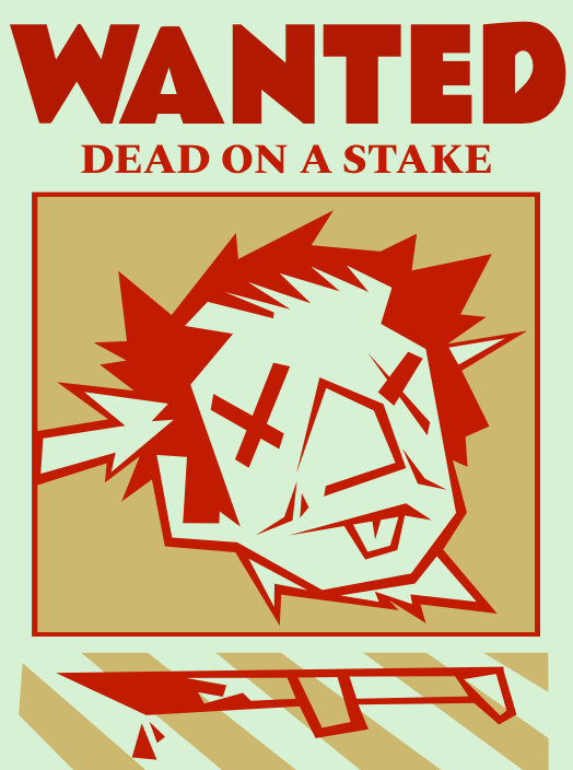
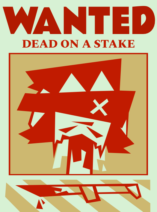
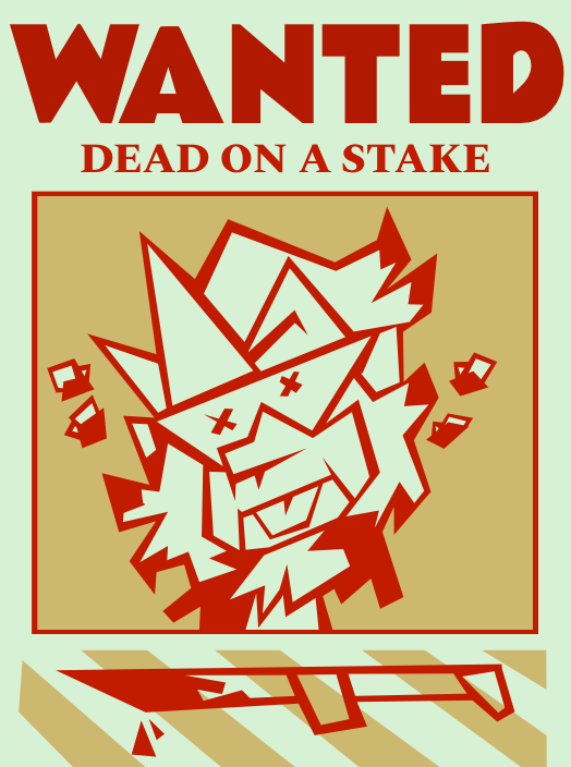
Anyways I’ve gotten really into posters. These are primarily anchored in the world of KILL THE MACHINE but they’re small and vague enough that it doesn’t matter where I place them.
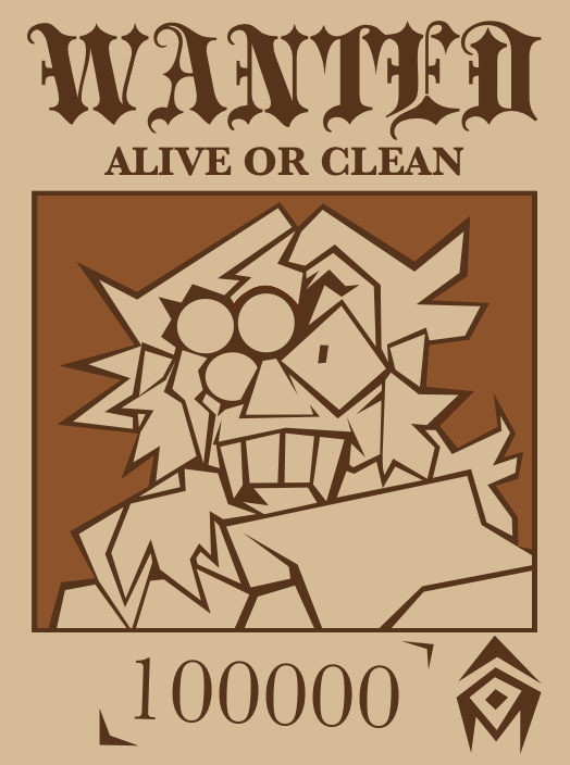
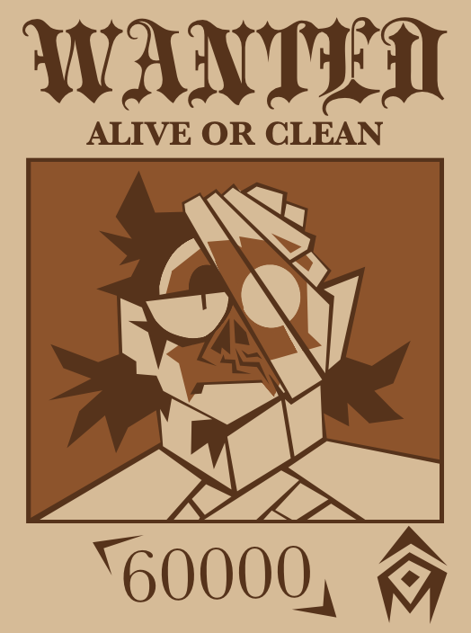
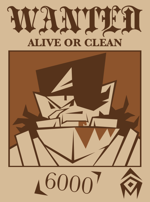
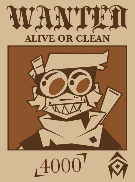
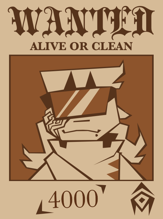
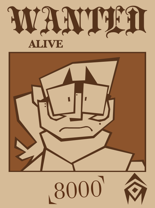
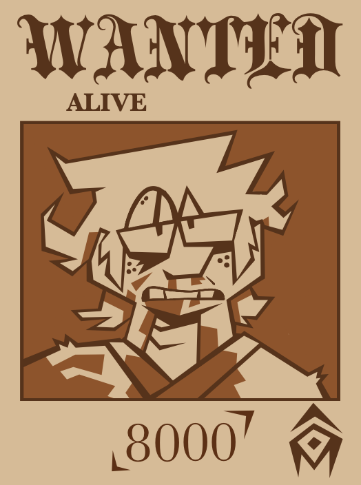
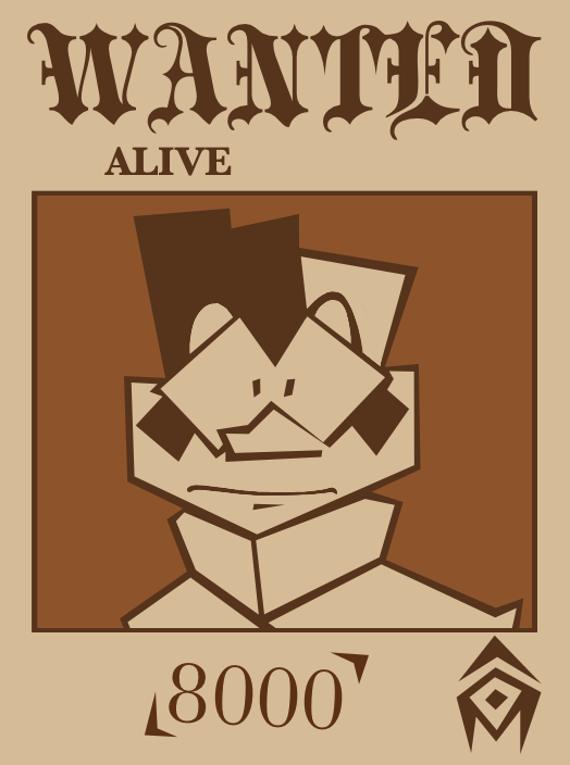
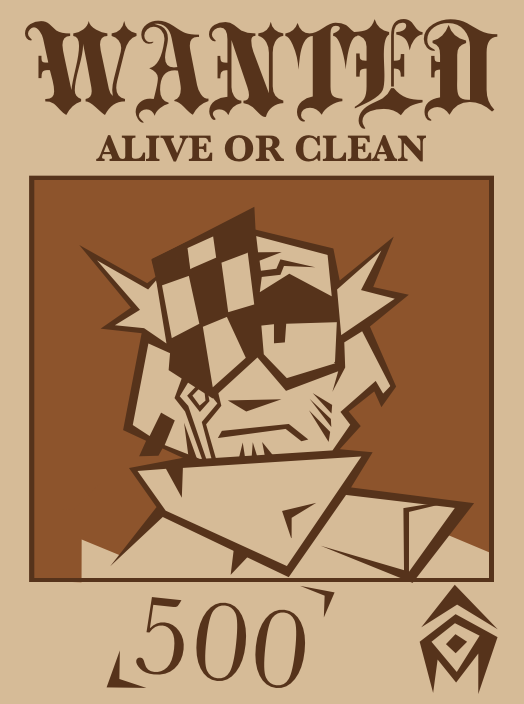
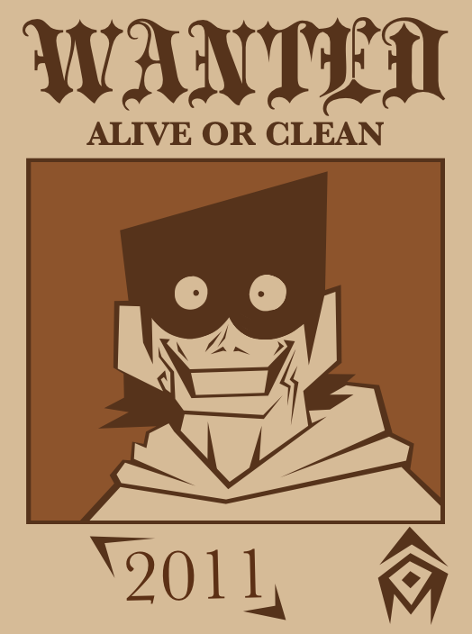
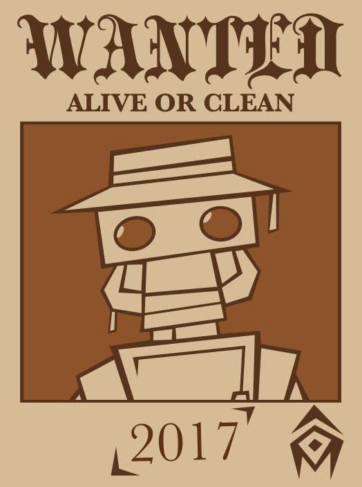
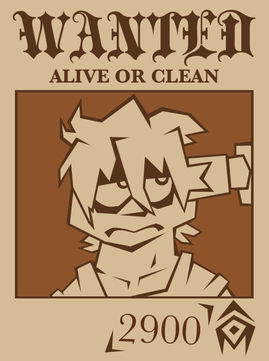
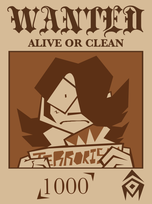

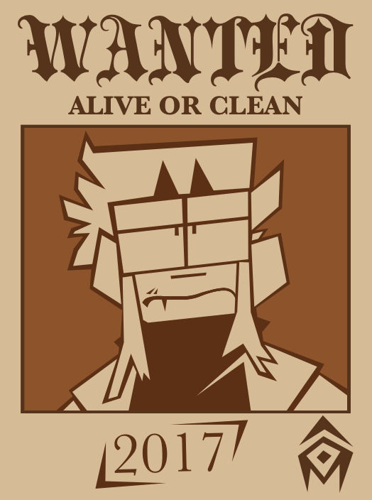
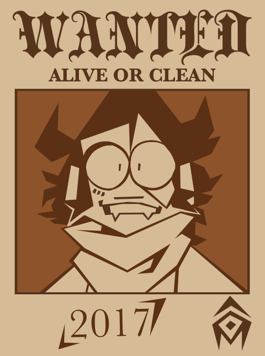
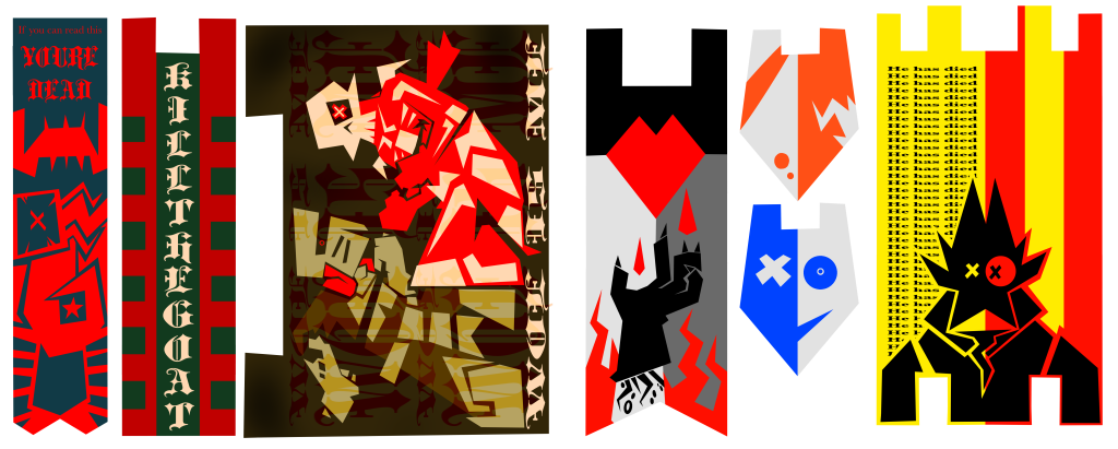
I like making posters because they add life and work in tandem with my other 3d art. Have more postaz. these are KTM themed banners. Honestly for the rest of this project I’m probably going to stick to KTW/M. My brain is on a roll. I have already slapped these on so many things. When this semester is done, I’m going to put a pdf with all these as mini scale printables.
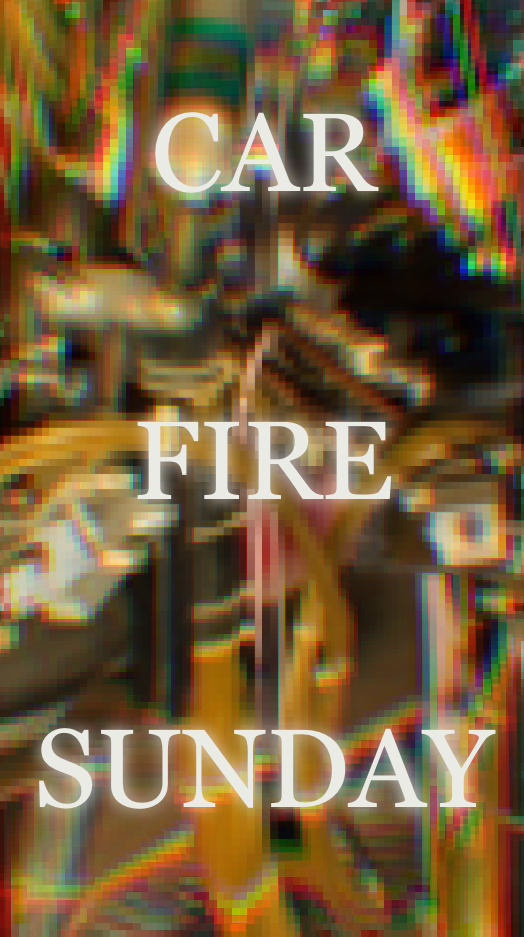
I need more posters to slap on foam bricks. Yeah, I need to make more bulletin boards. I need to make more. It’s so fun.
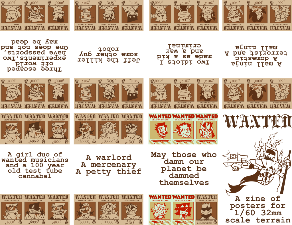
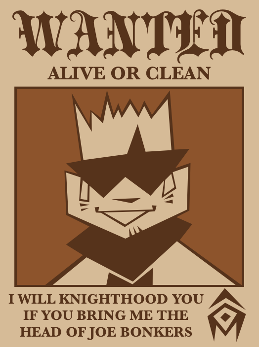
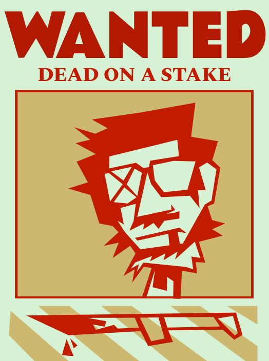
This is a different take on the wanted posters seen a bit above. The idea is that they’re political posters parodying wanted posters calling for the death of certain politicians whose wartime and postwar policies hurt the people.

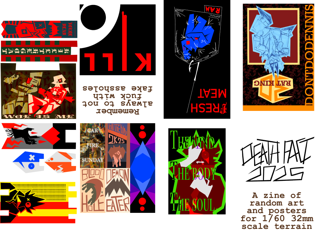
final showing:
I assembled my previous work into 2 zines. Have fun.
Zines and paperwork with paper are things I’ve been doing for a long time. I’ve been messing with papercraft since I was about 4. I know how to put these together, like I know how to brush my teeth. “WANTED” came out a lot more thematically coherent. The cover is a cleaned-up sketch I had in the back, an homage to really old game books like Chainmail. I need to model that guy properly. They look a bit wobbly and not centered right, but that’s because I factor in printer margins. When making these, what held them together was the thought of “would I put this on my wall or a piece of terrain?” Quite a bit of it was me flexing my style in character design. The vibe I chase after is a bit morbid in a medieval style with a modern lens.